Background
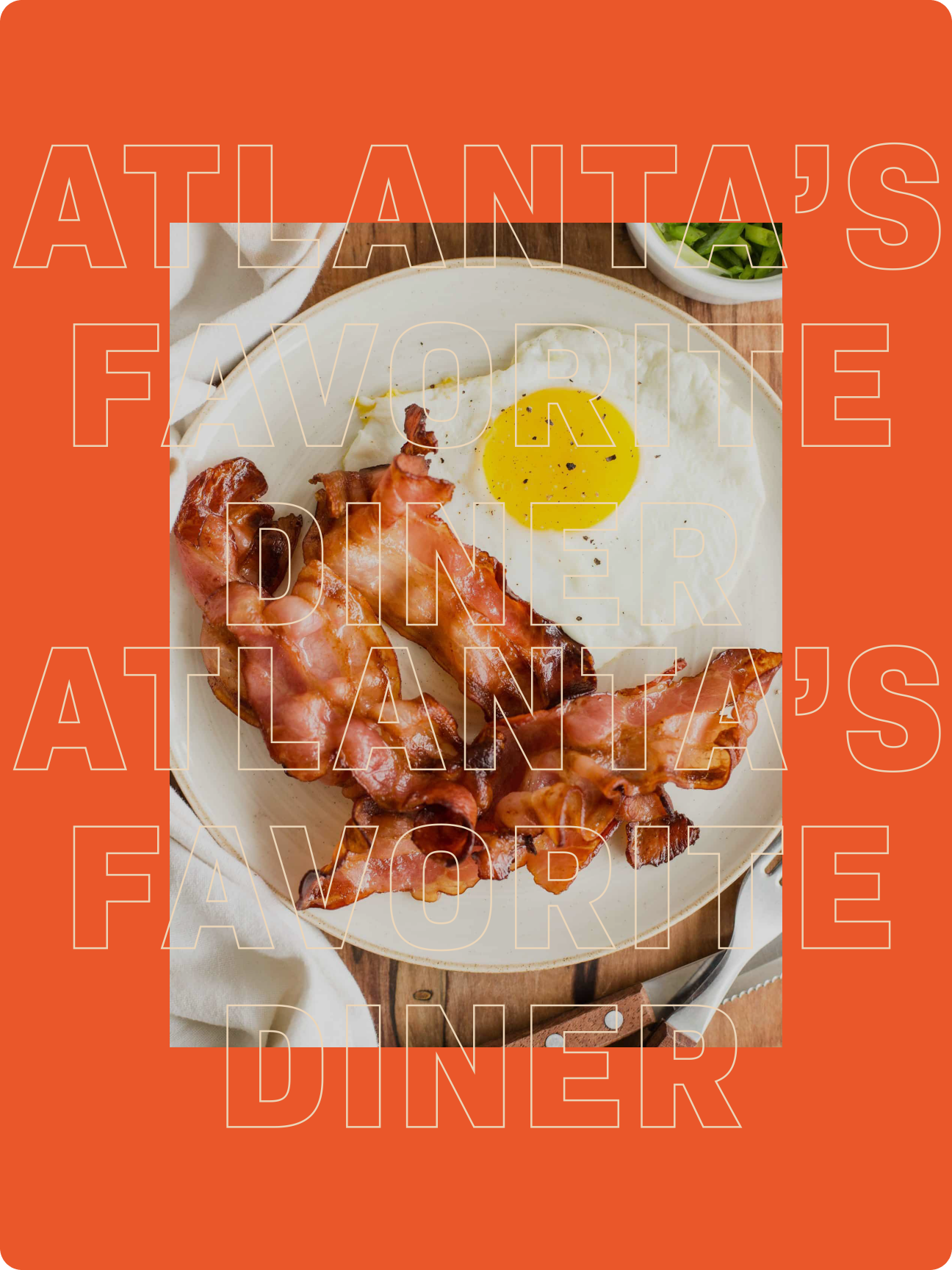
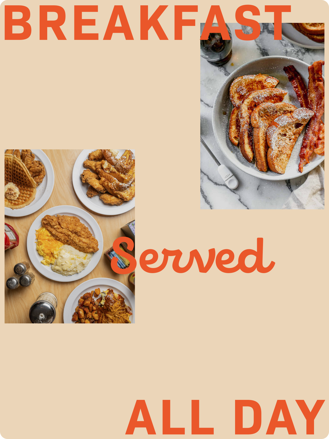
Thumbs Up is an Atlanta-based diner that prides itself on setting the standard for breakfast dining. It is a neighborhood meeting place that serves amazing food at reasonable prices with a friendly staff. Since opening its doors in 1984 in the Old Fourth Ward, Thumbs Up has been a staple in the metro Atlanta area with 7 locations.
The goal of this project was to give Thumbs Up a modern, dynamic visual identity that resonates with the metro Atlanta community.
Scope
Art Direction, Brand Identity, Visual Identity, Graphic Design, Poster Design
My Role
I worked as the sole designer for this project.
Tools
Adobe Photoshop, Adobe Illustrator, Procreate
The Challenge
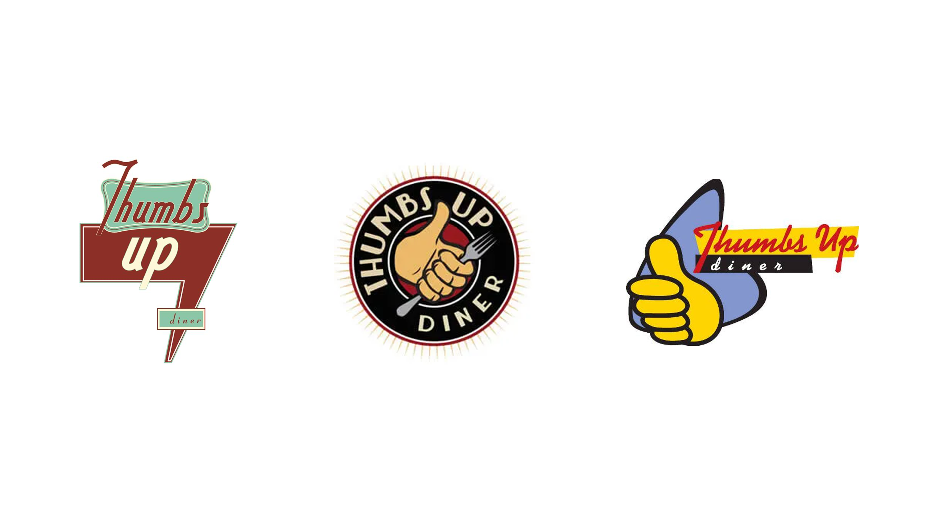
When I started my research on this project, I was trying to find their current logo and I noticed that Thumbs Up currently uses multiple logos for their branding. Most locations currently uses the logo on the left while some locations uses the other two. This maybe due to locations being independently owned but nonetheless, this restaurant is in need for a rebrand.
The Process
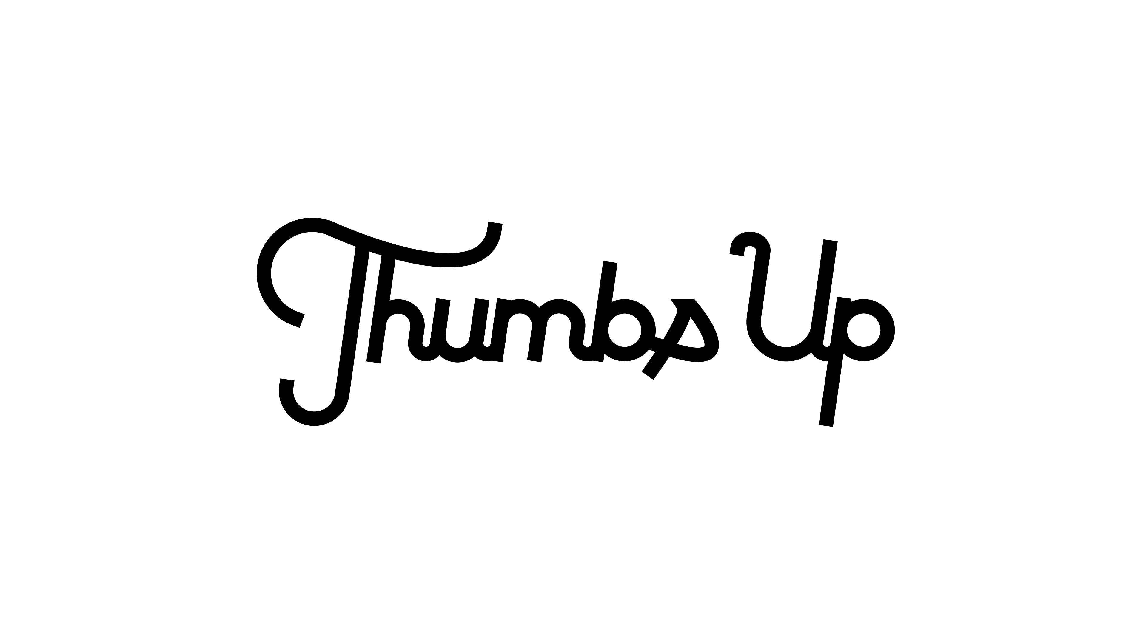
Logo
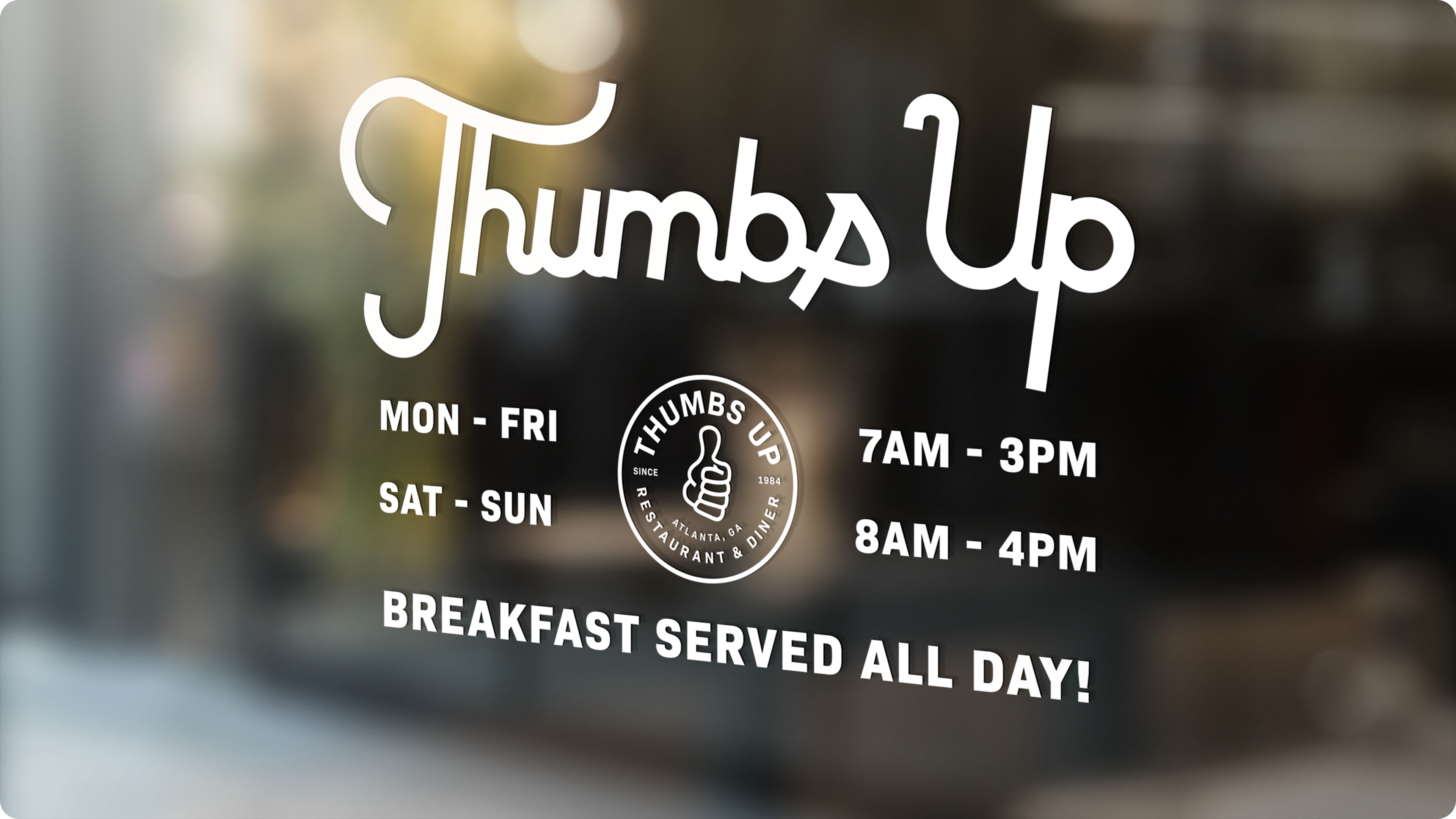
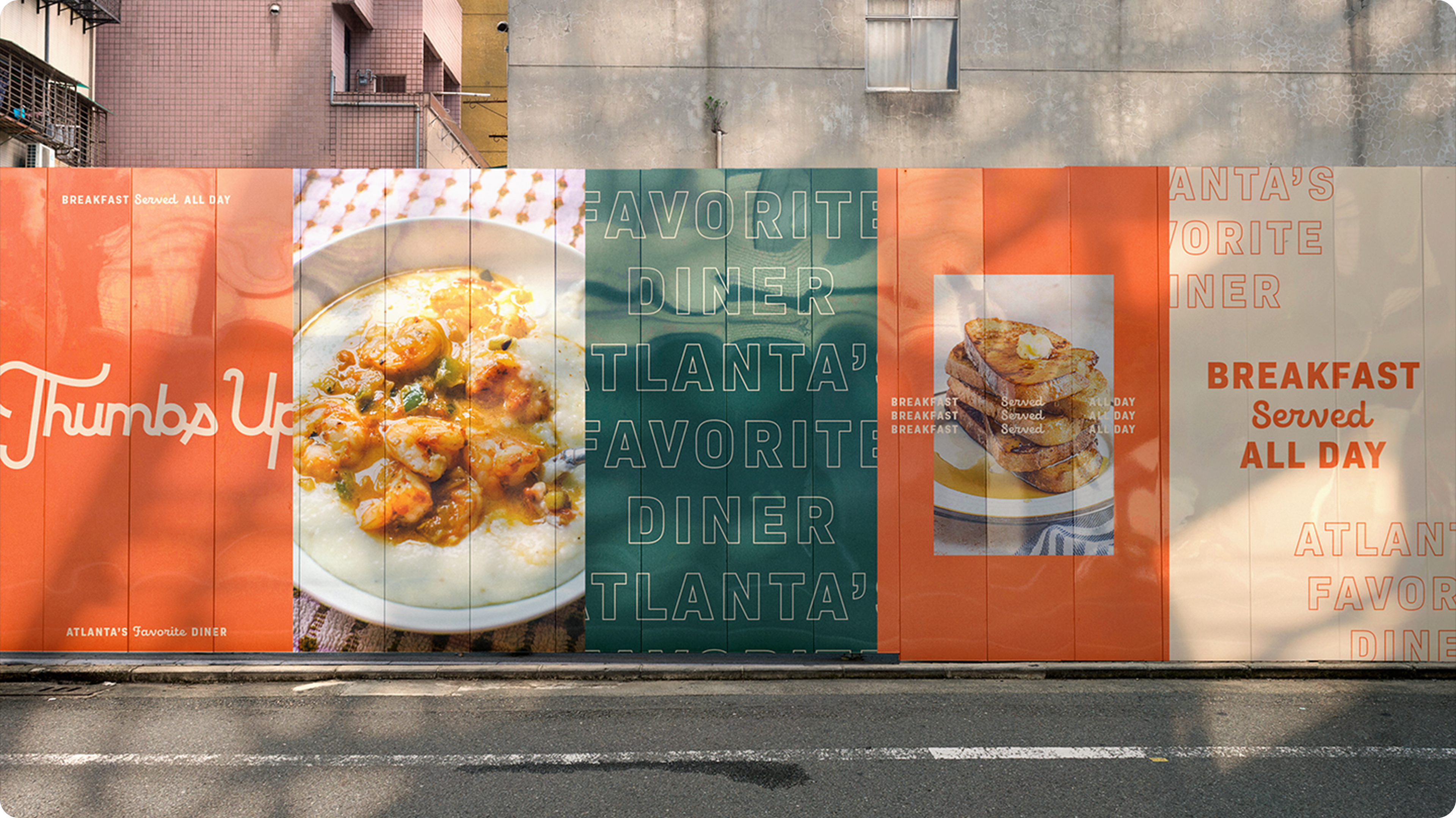
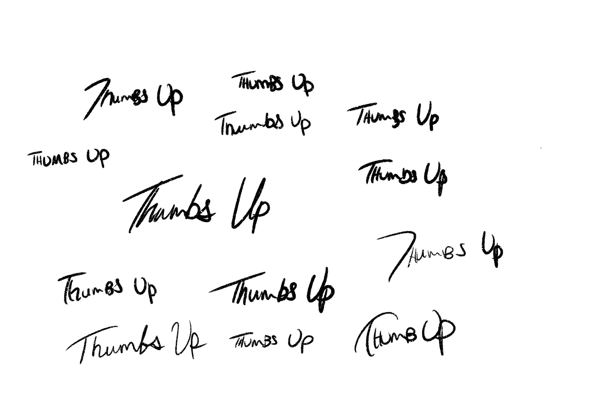
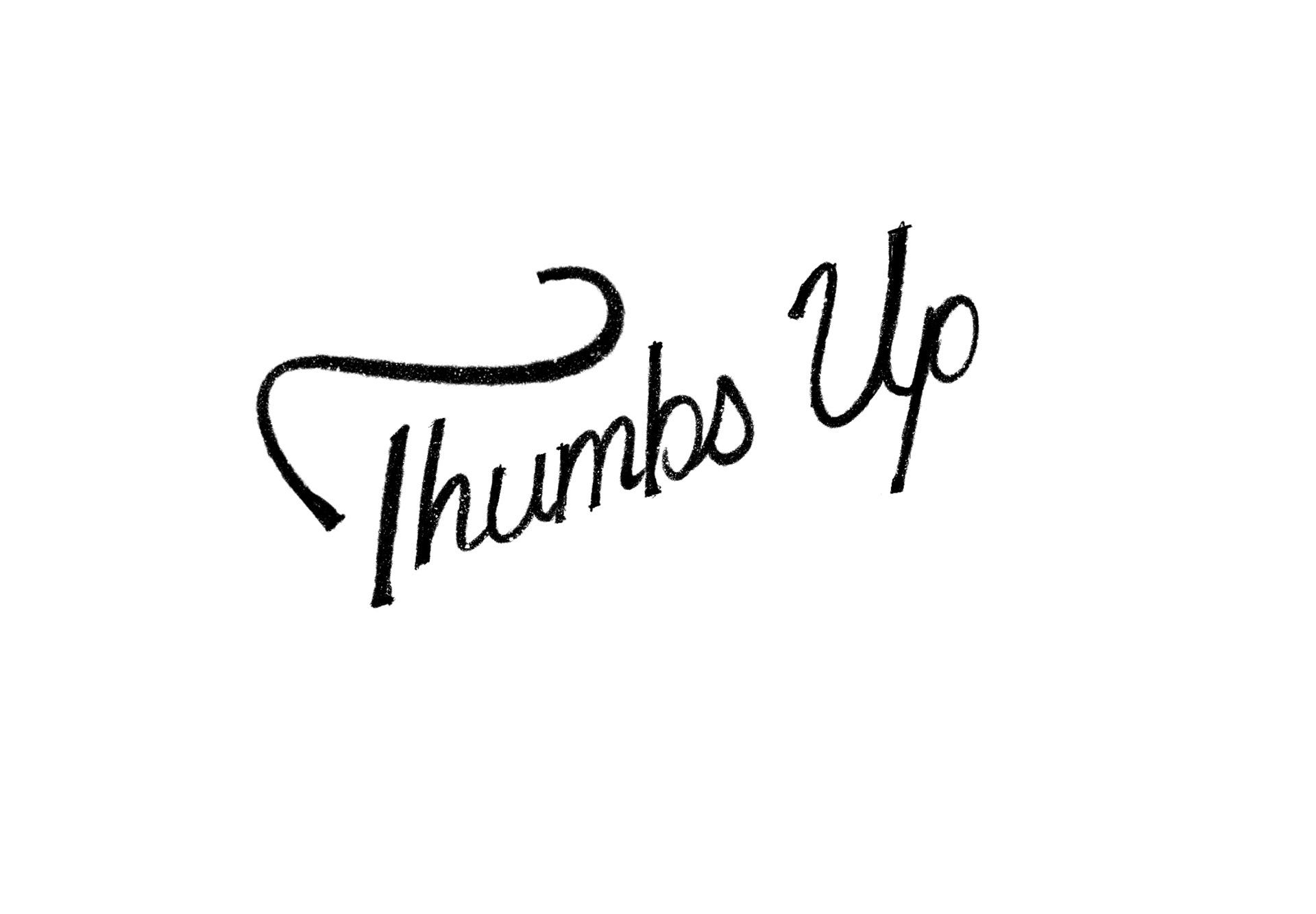
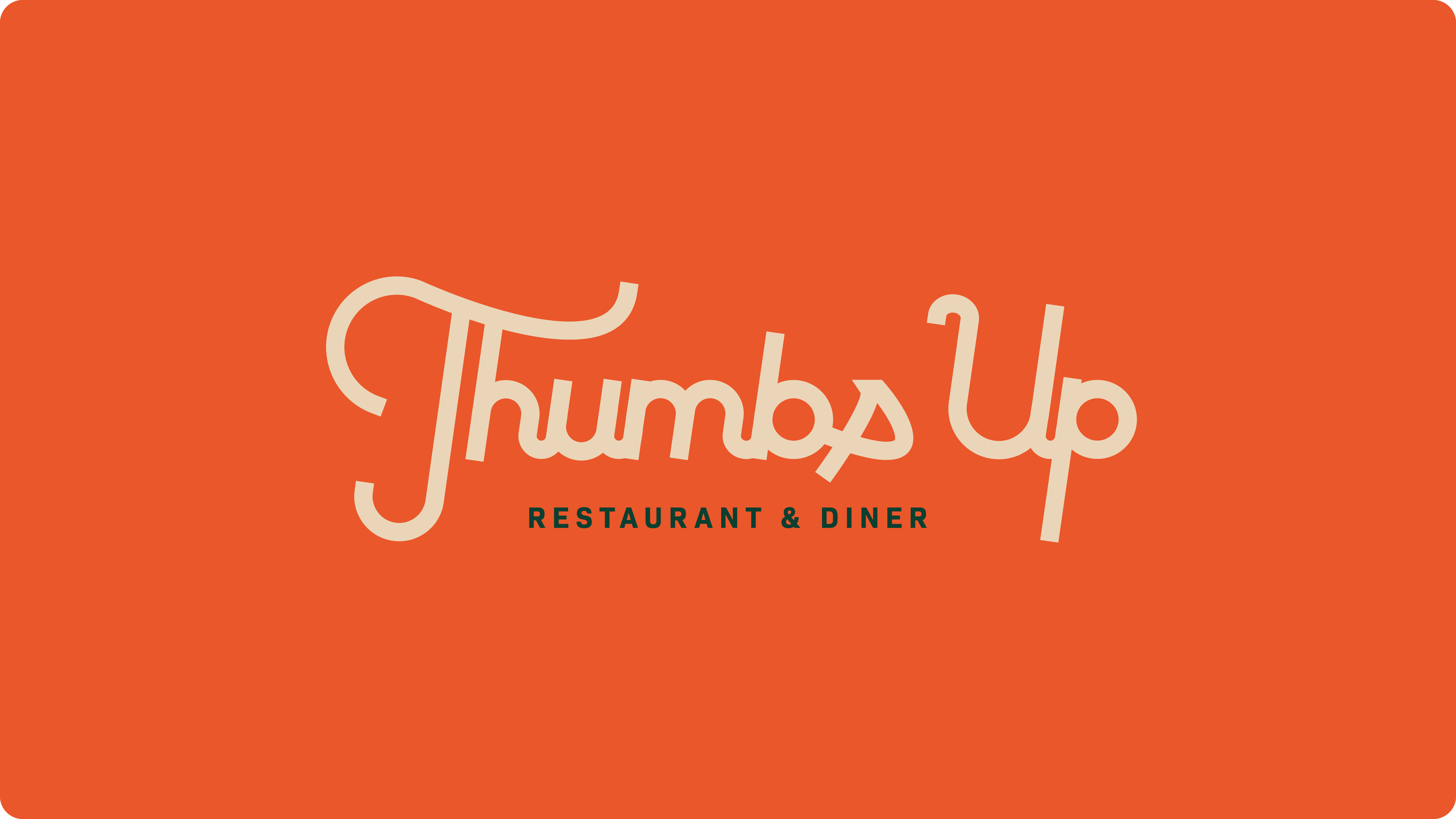
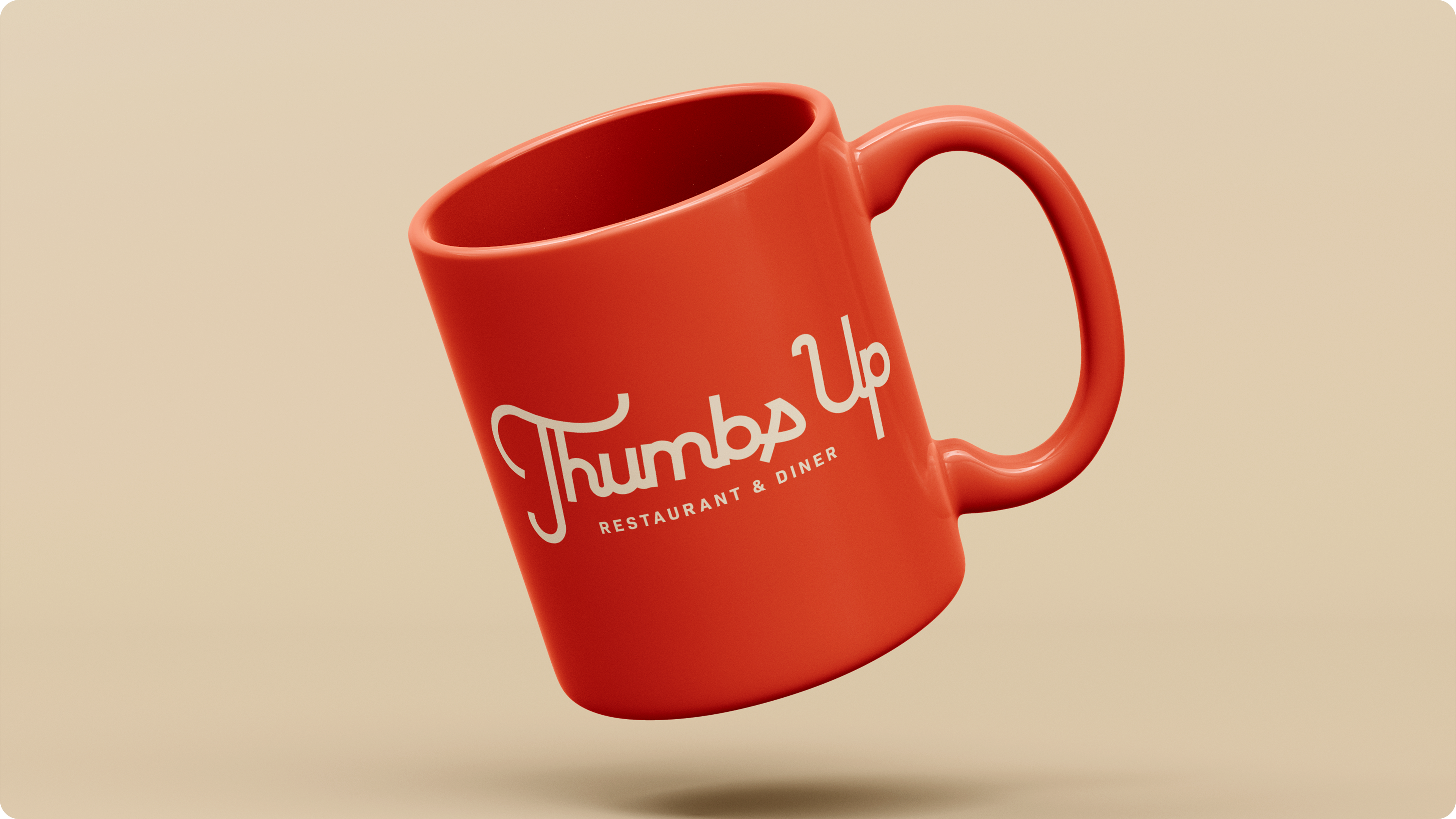
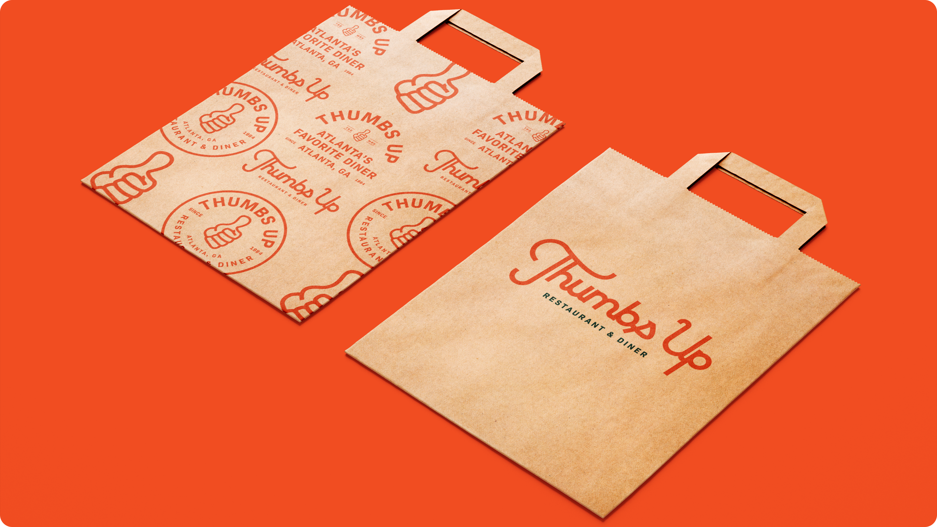
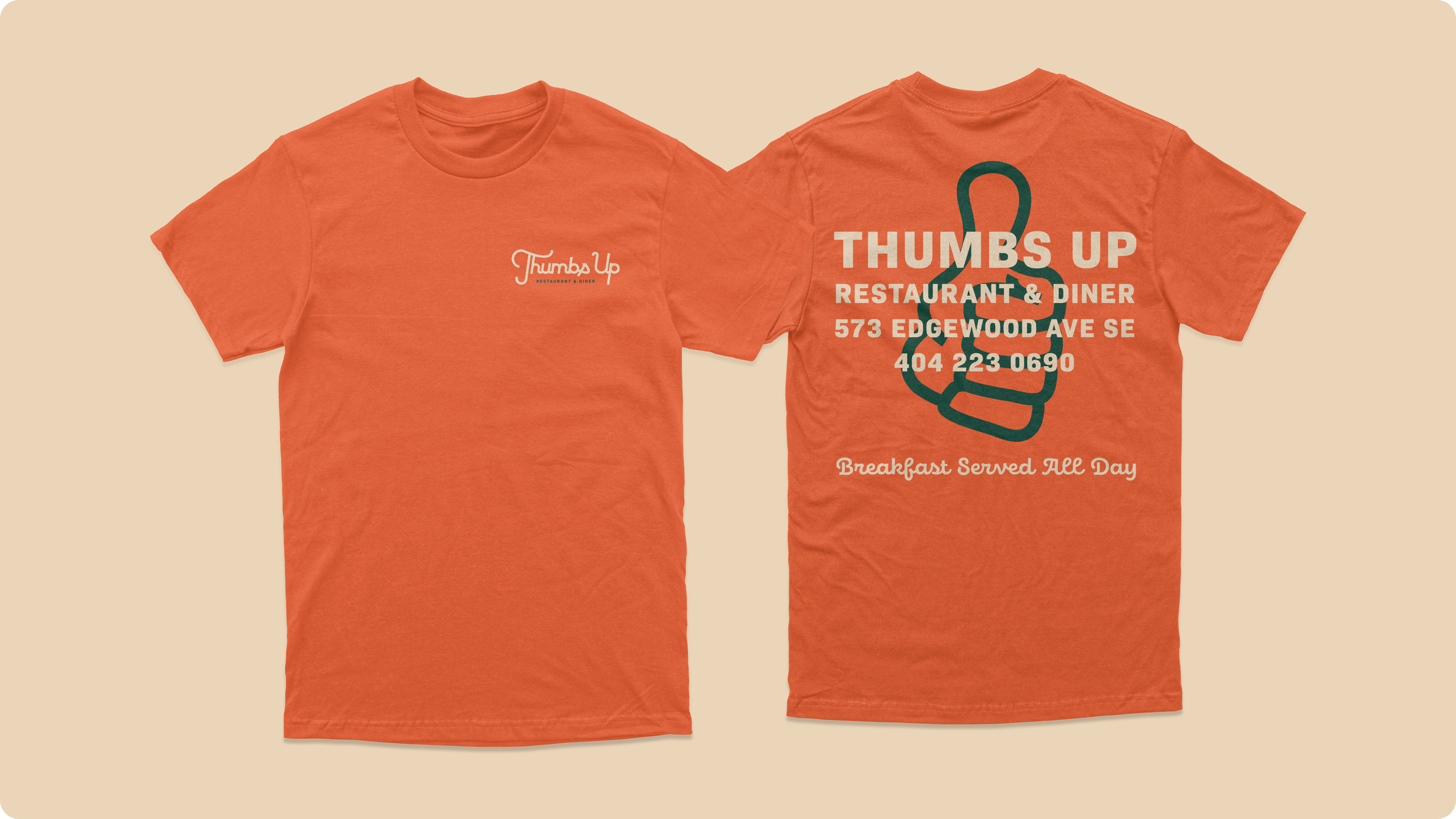
My intentions was to create a mark that was inviting to match the experience you have when you visit a Thumbs Up location. It’s a warm, family-oriented experience with home cooking-inspired meals and the best way to illustrate that was to create a script logo.
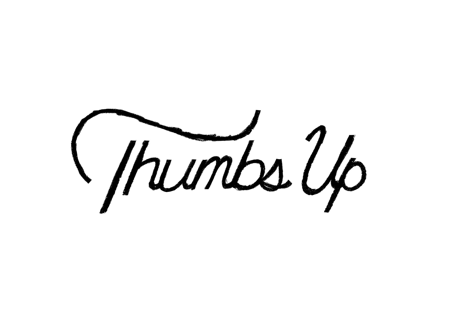
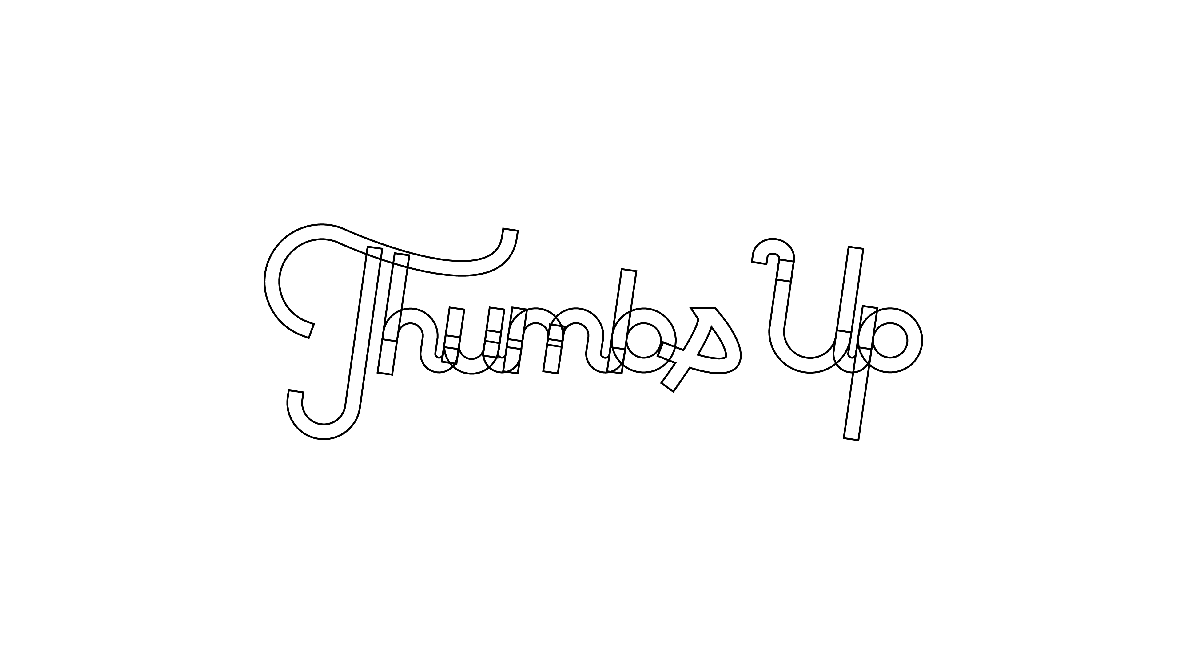
Sketches
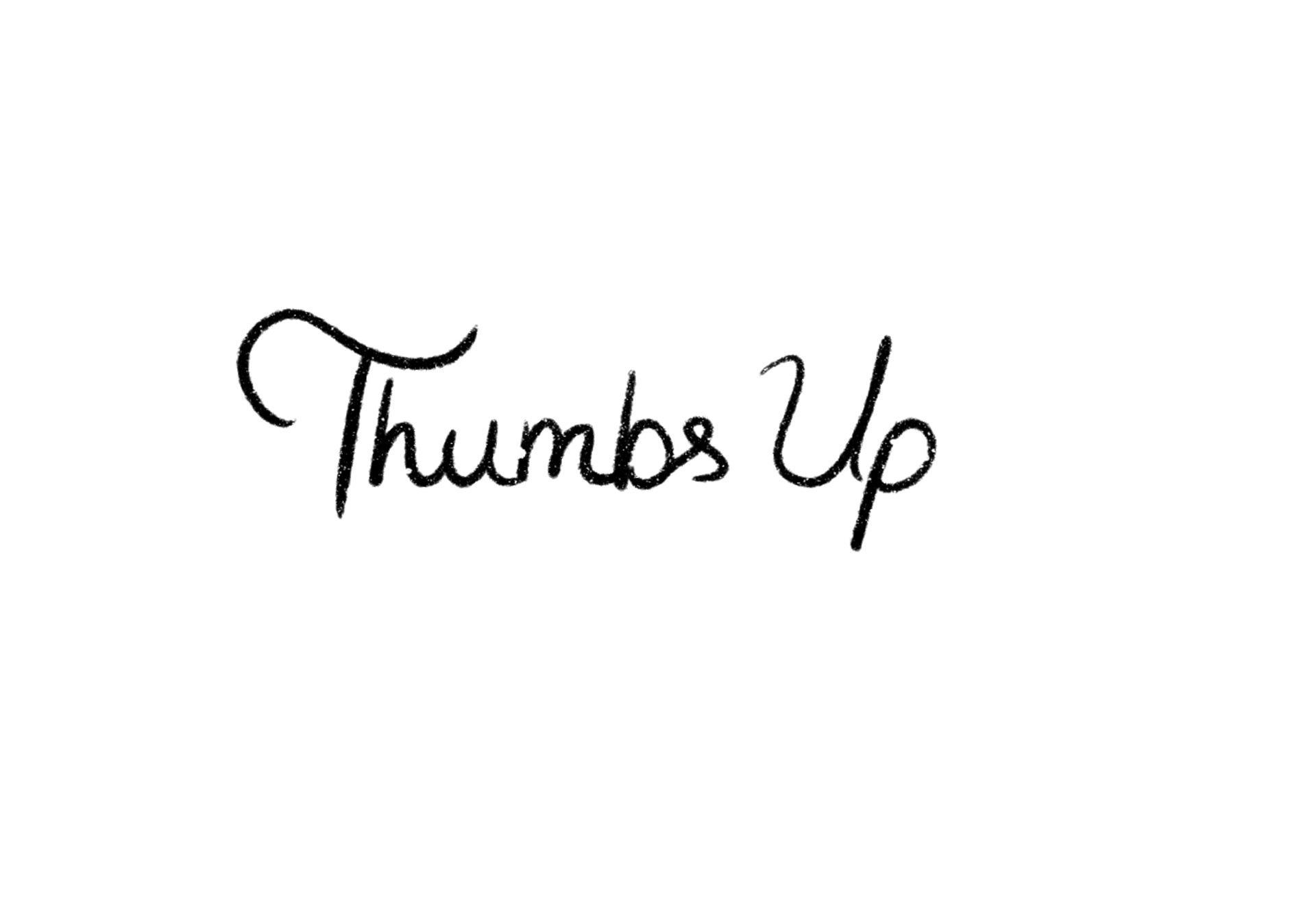
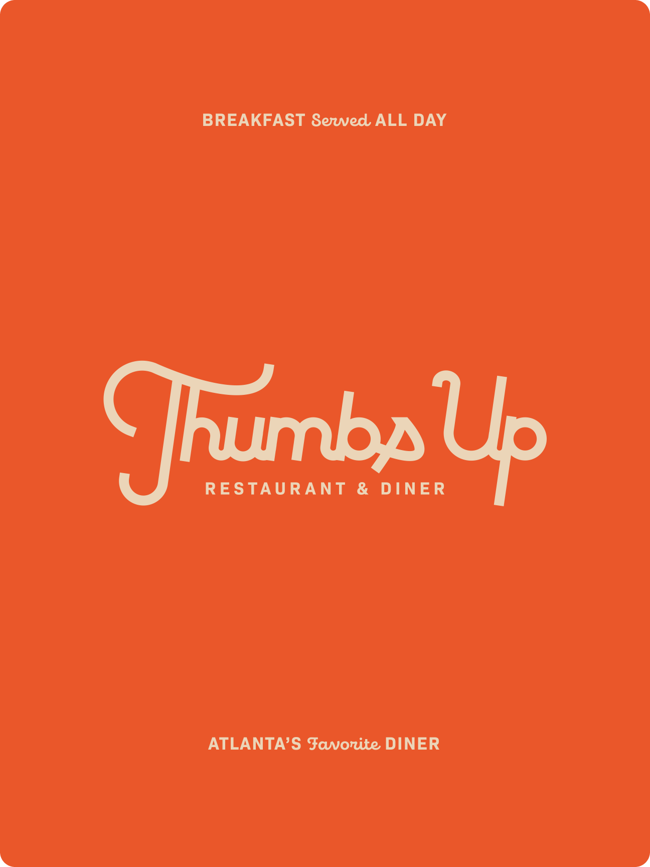
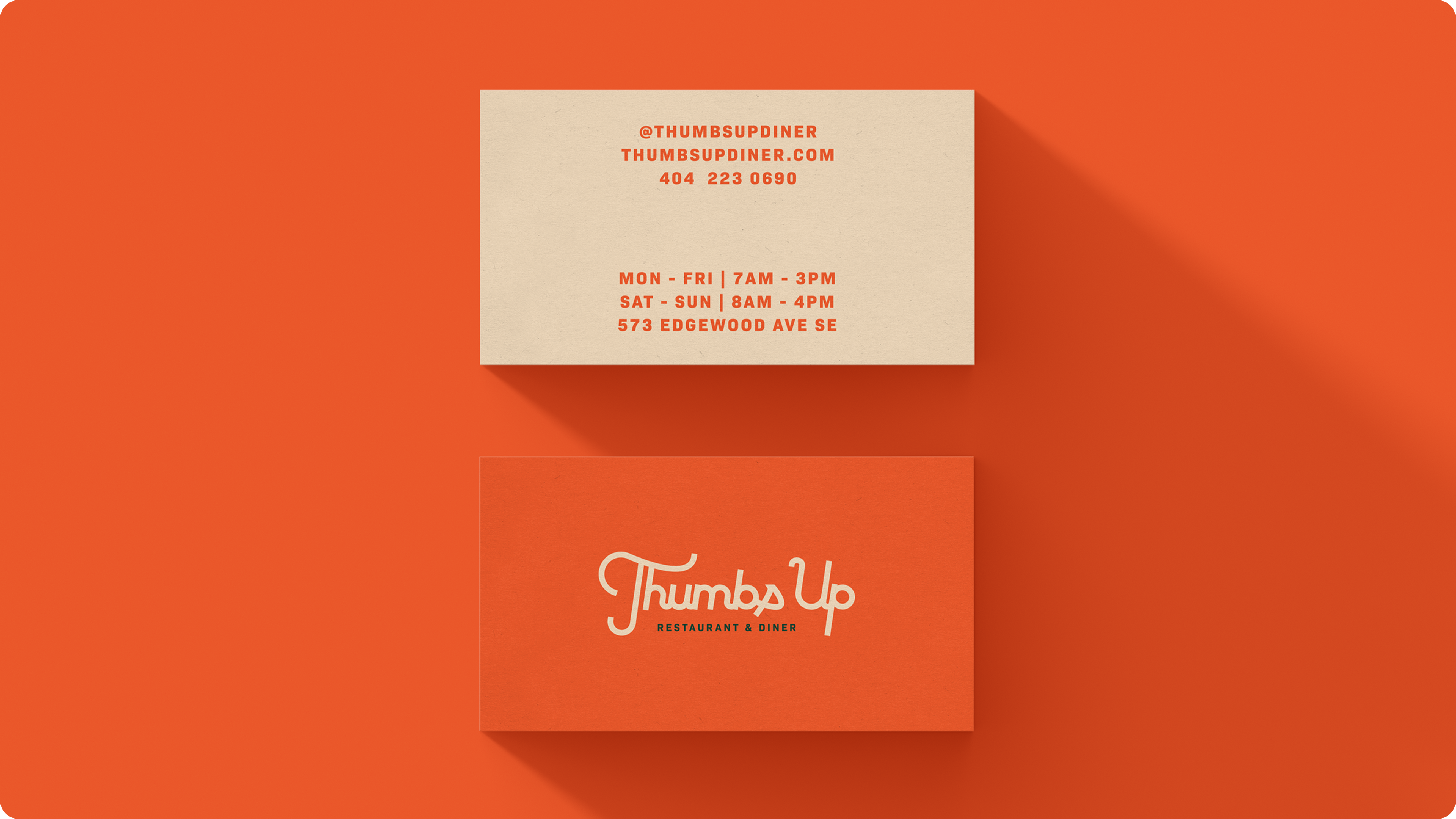
Final Logo
Alternate Logos
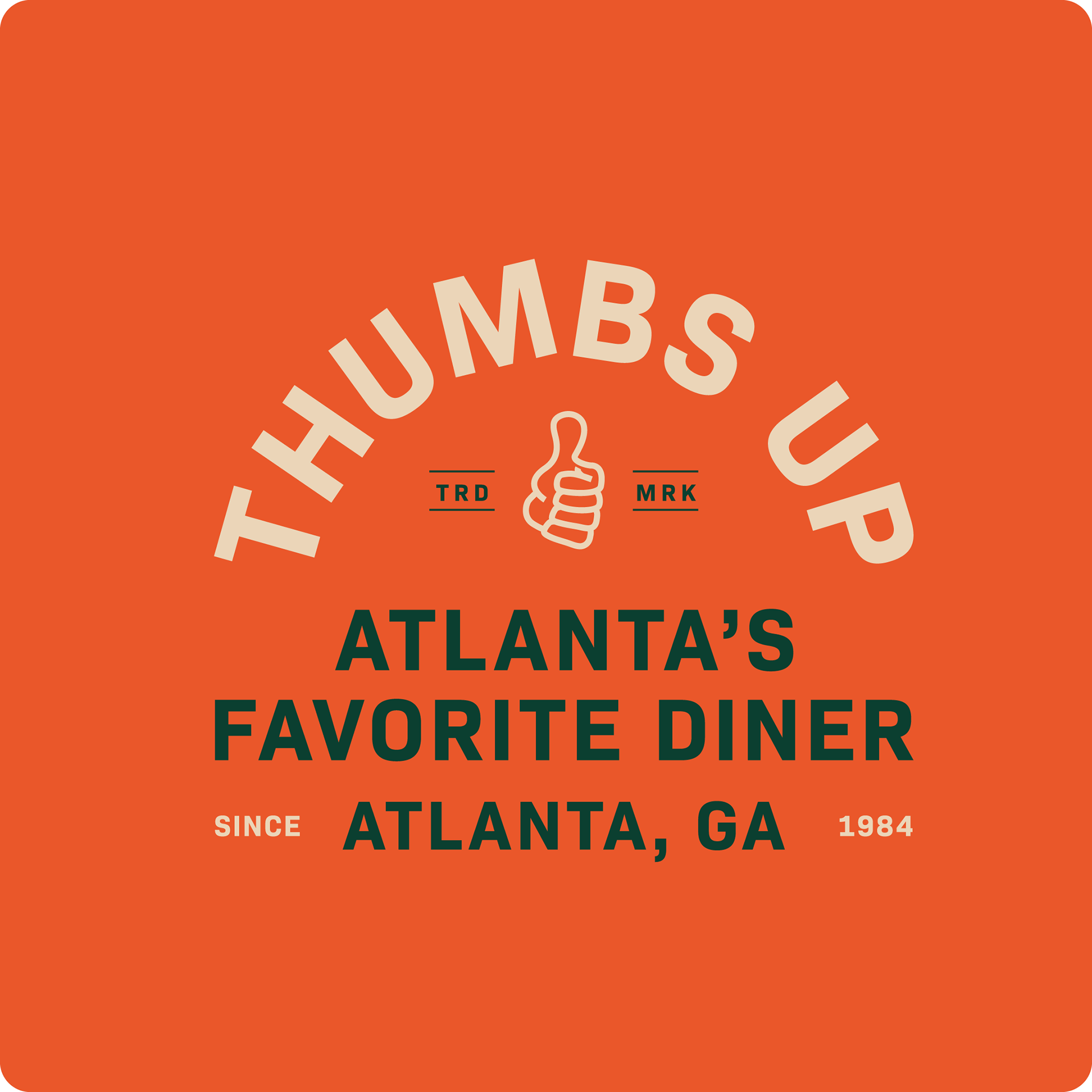
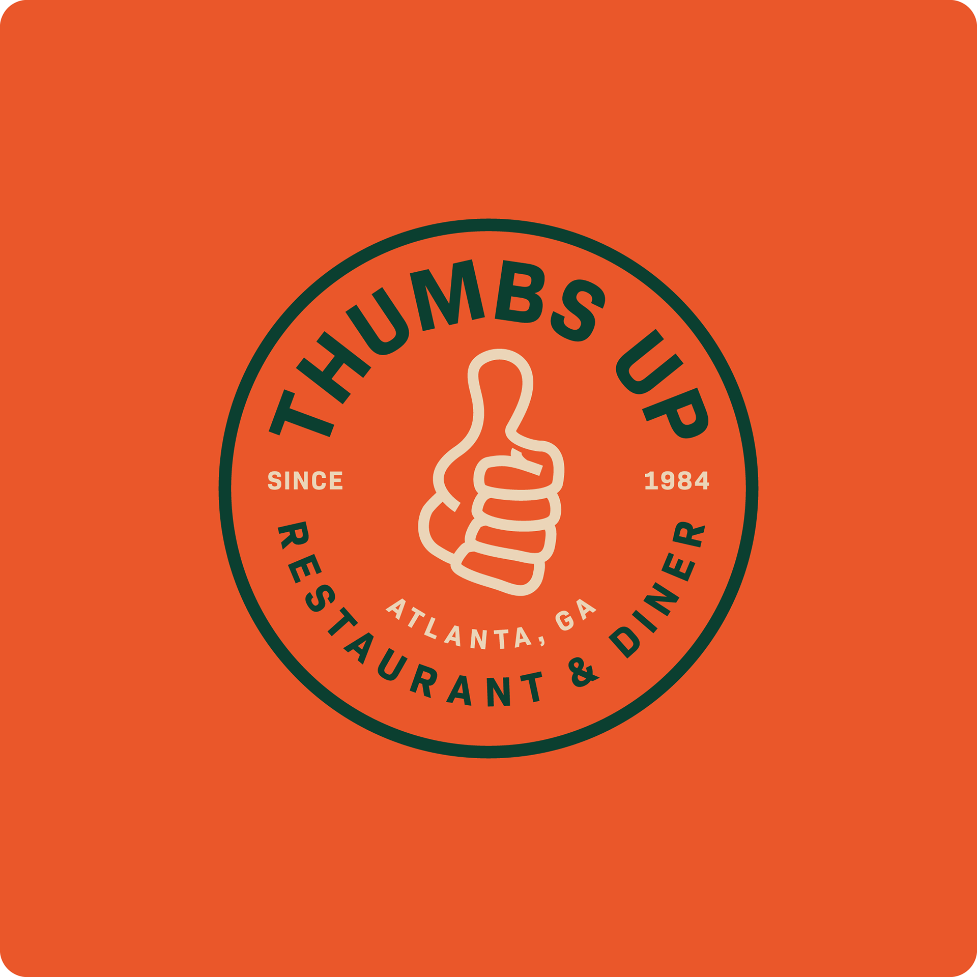
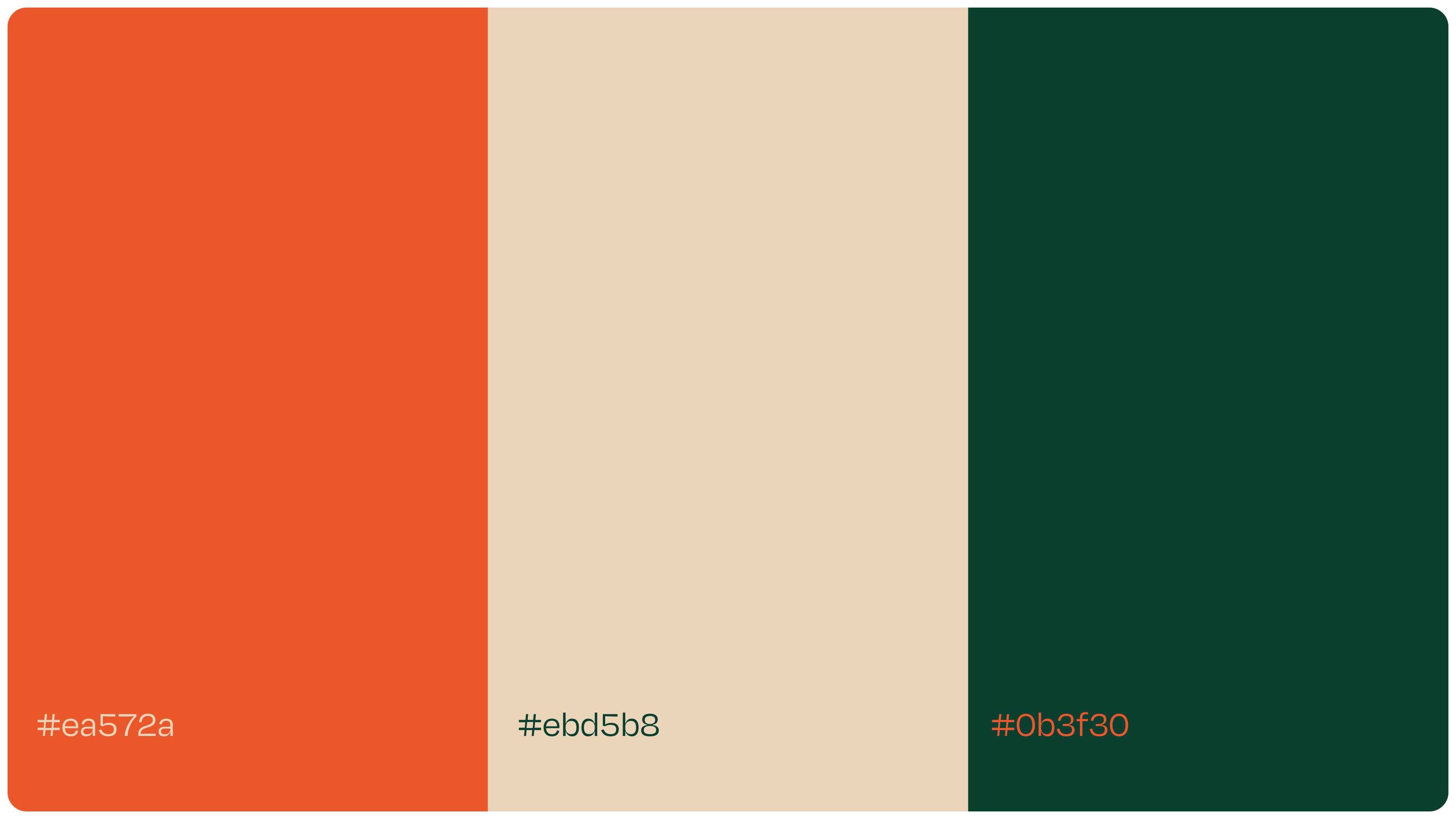
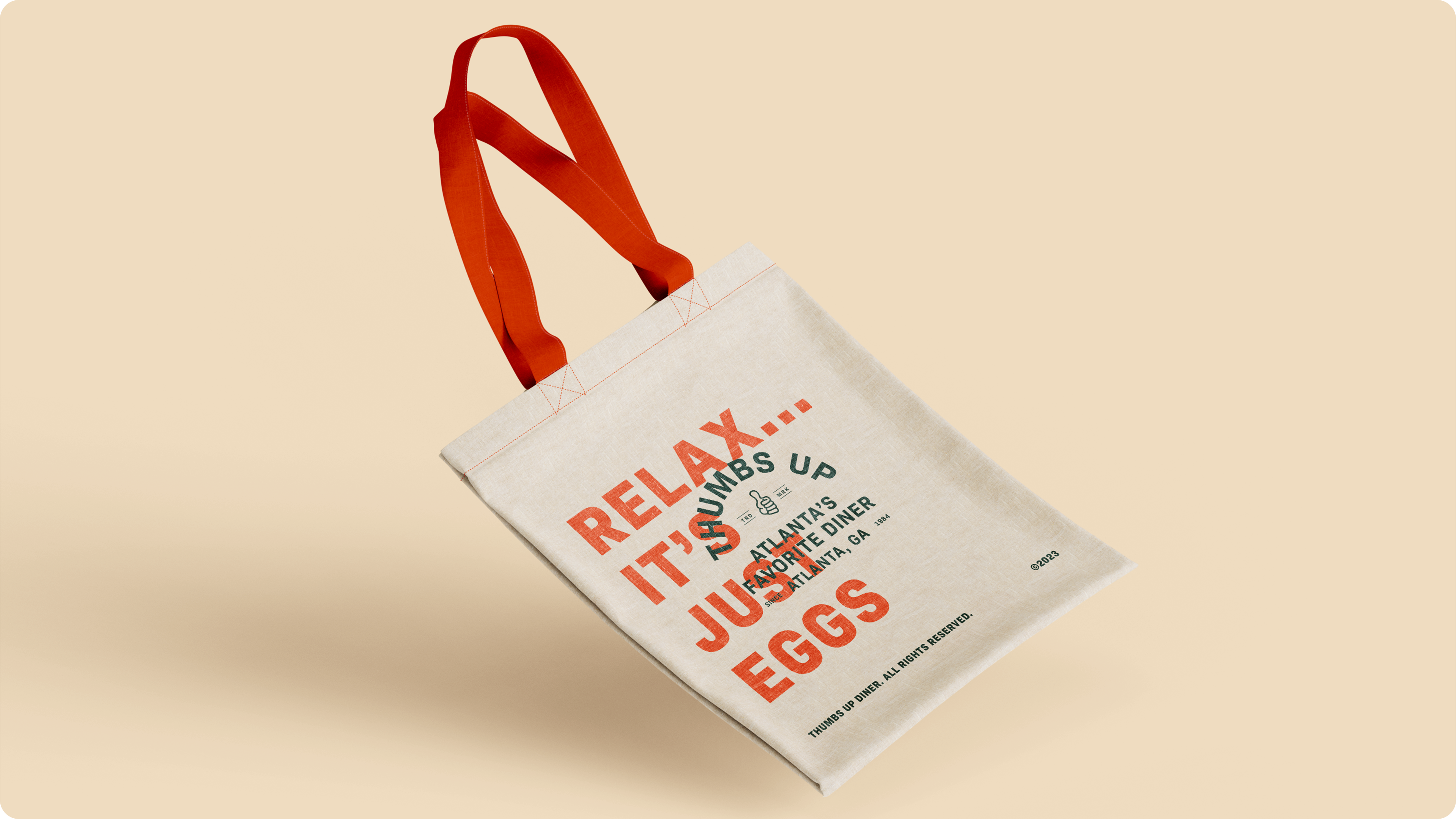
Color Palette
I wanted to pair the script logo with a combination of colors that represents community. Orange being the primary color, complemented with an olive green to illustrate joy, happiness, and good eating.
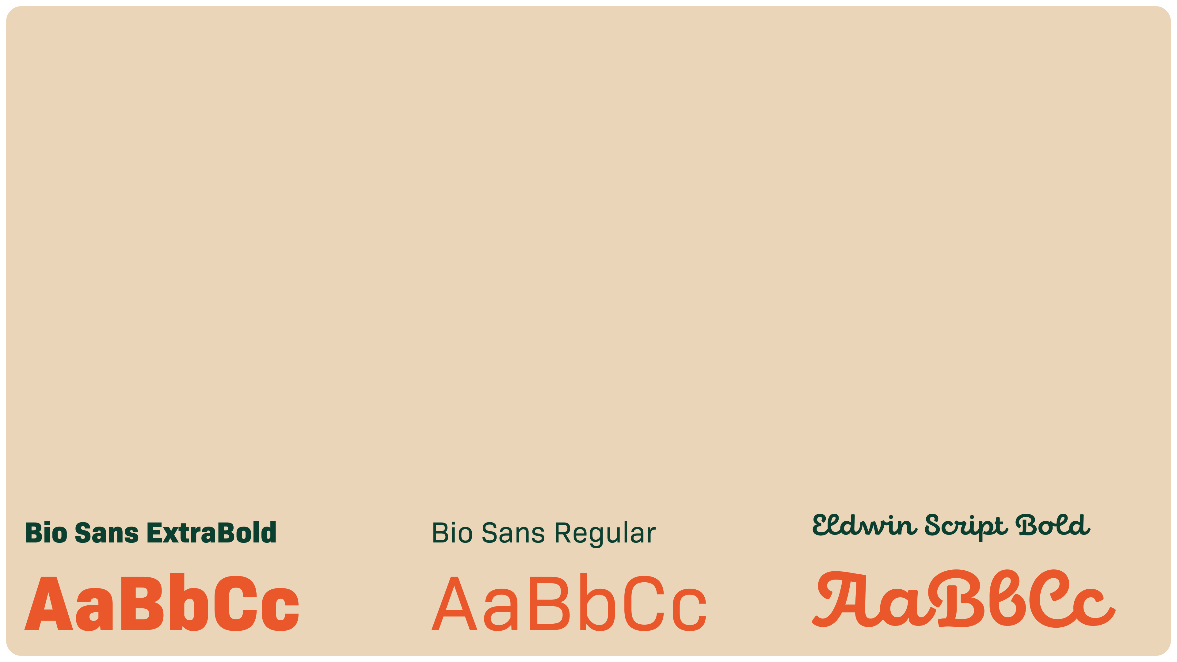
Typography
Bio Sans and Eldwin Script Bold are typefaces of choices that best fits the logo and overall branding.
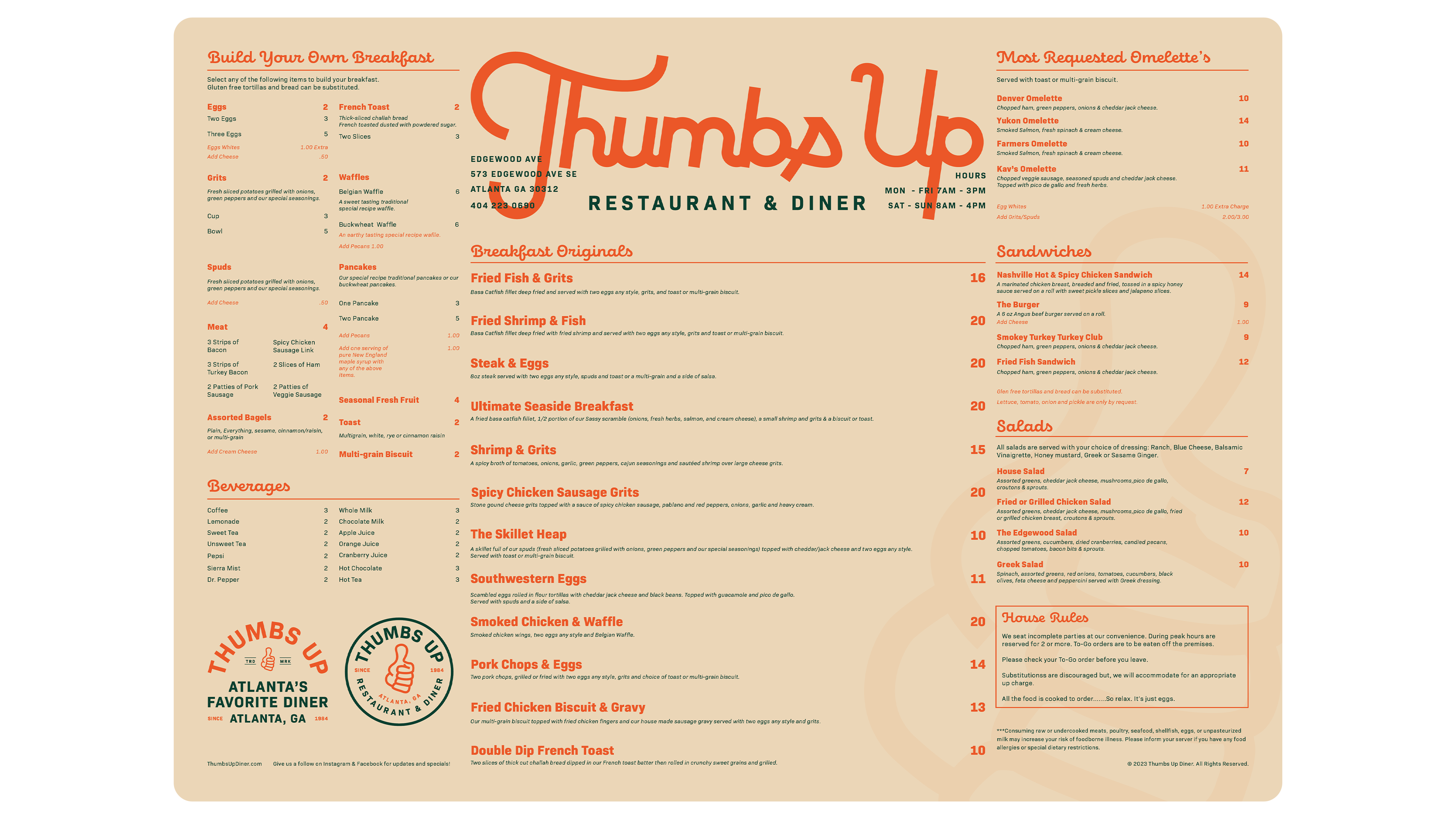
Menu Design
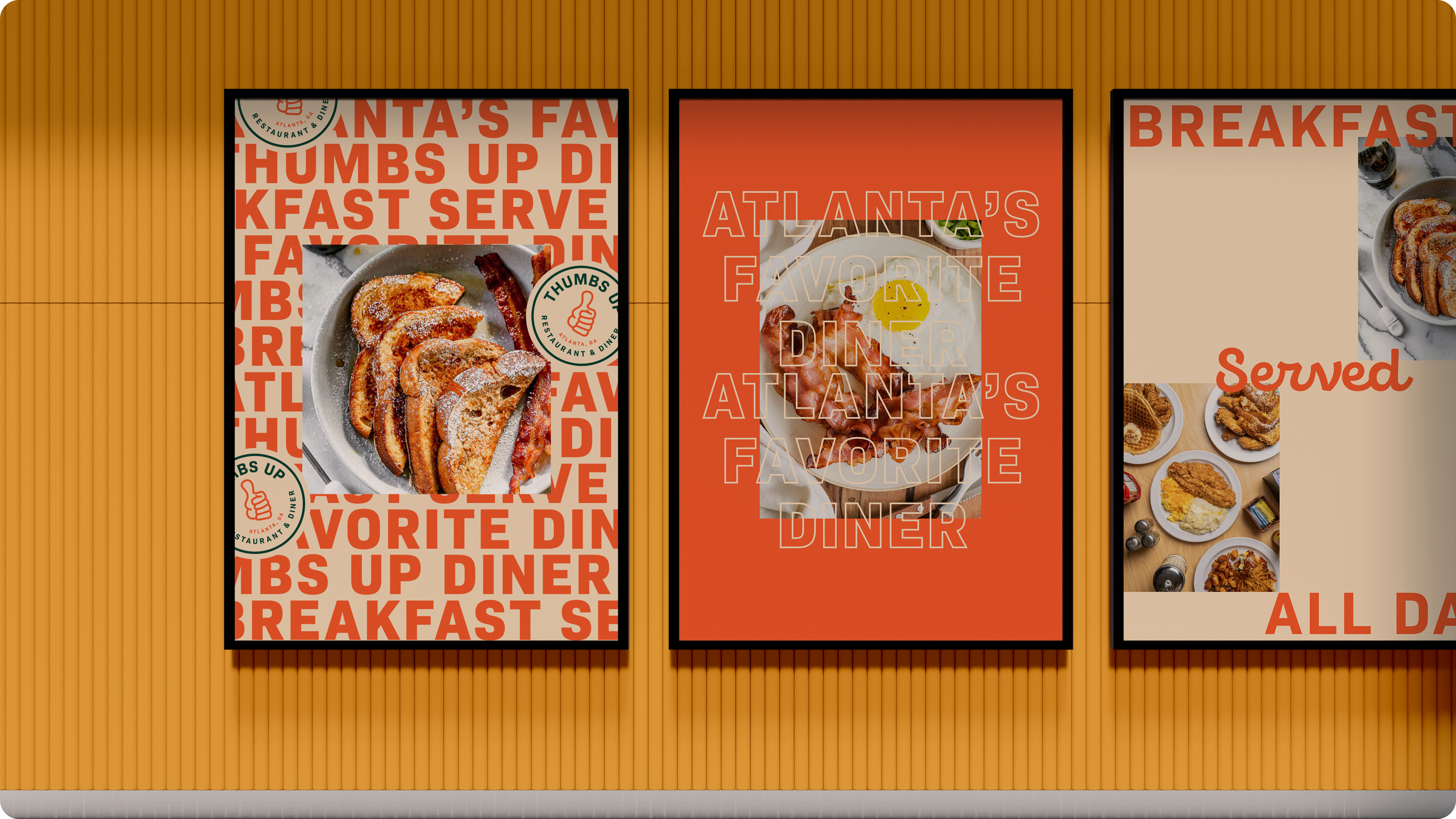
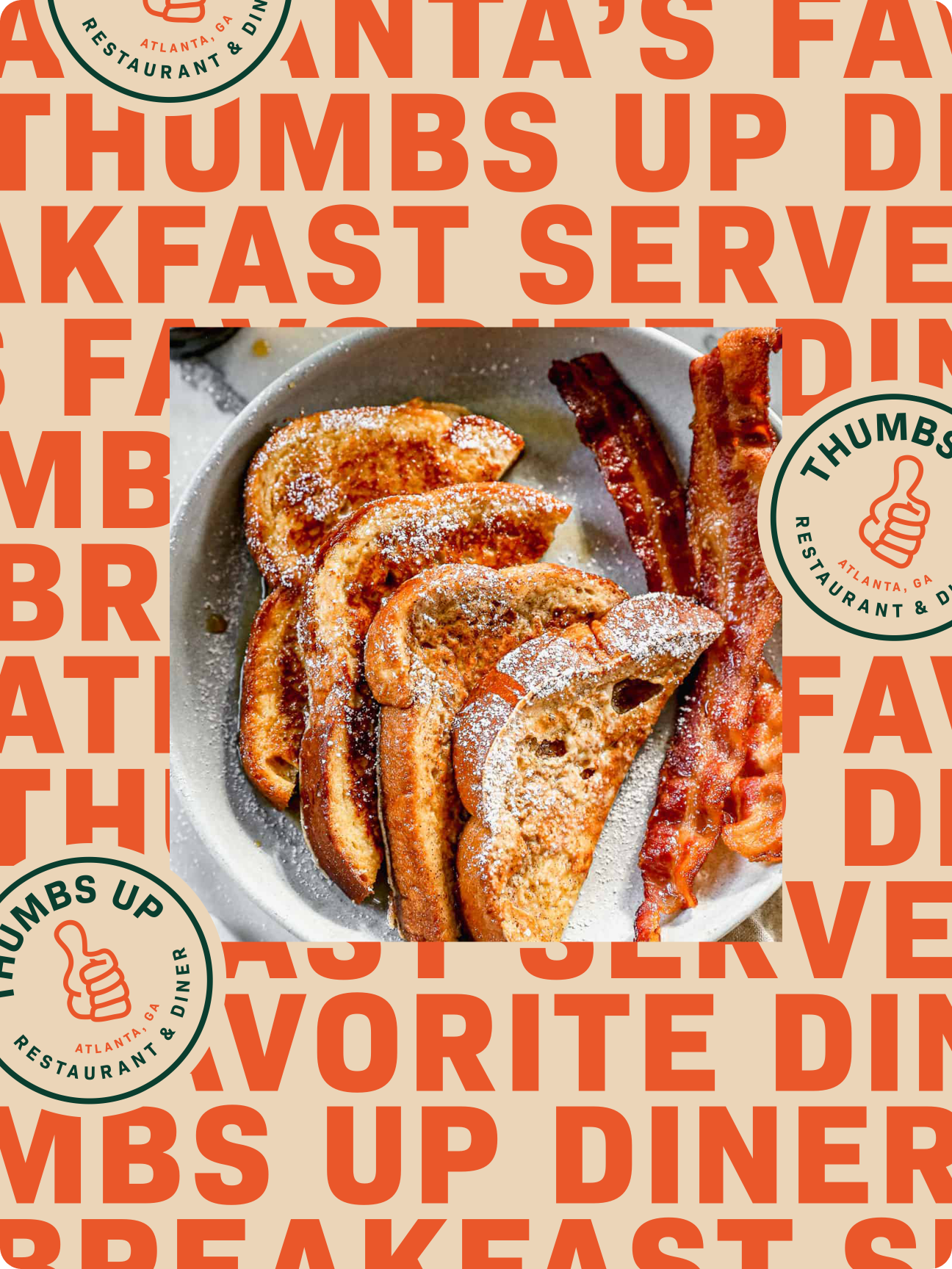
Poster Design
Stationaries

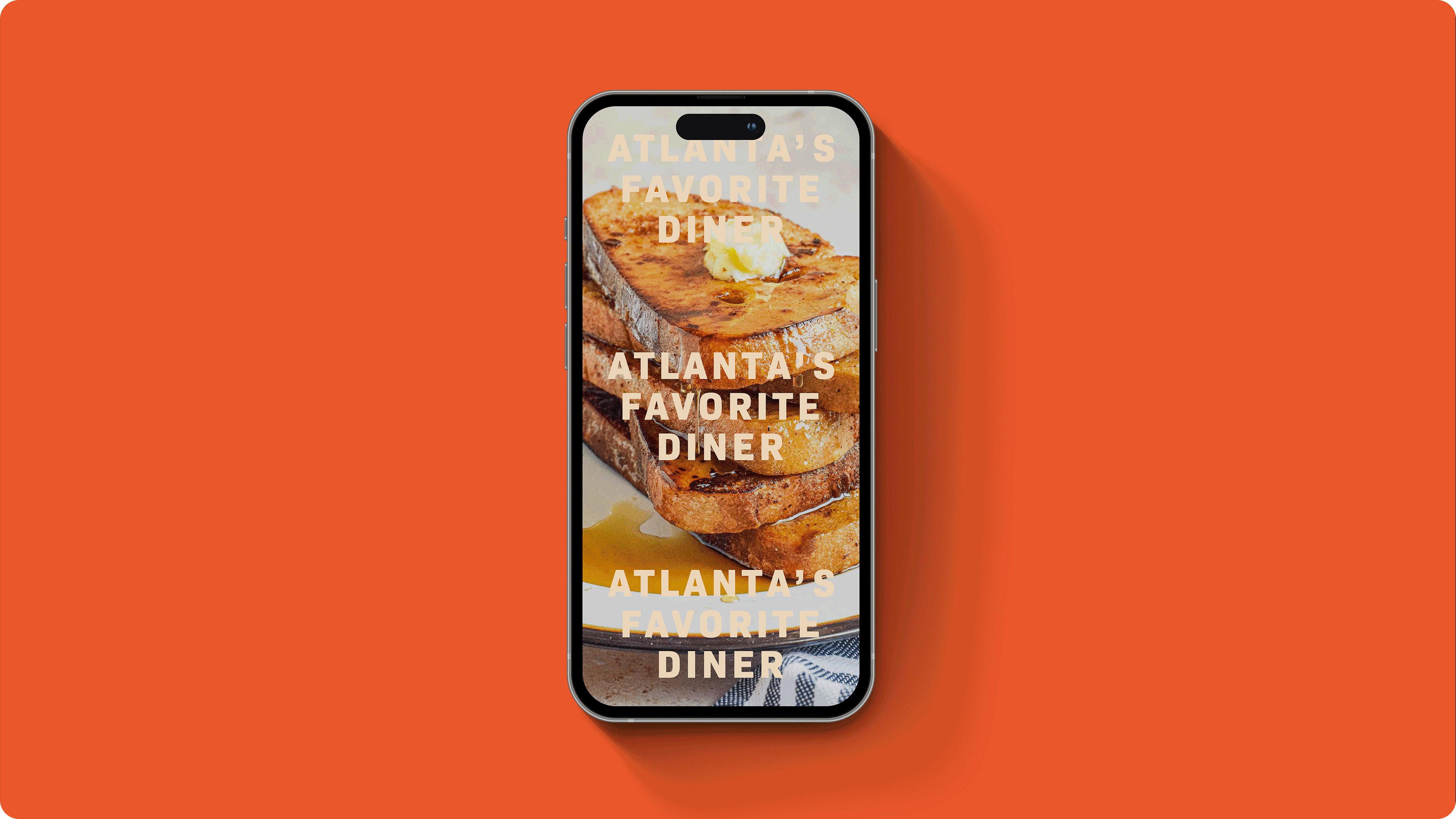
Social Media
Billboards, Posters, Wall Signs, etc....